Installation Instructions
Basic Installation Instructions
1. Including Script Tag
Extract the source files from the zip file (kwesforms_react_v1.zip).
To include the required script tag, add the following to the <head> section of your HTML:
<head>
    <script src="/assets/js/entry-loader.js"></script>
</head>
2. Embedding a Form
Embedding a form is easy, you just need to know about a few attributes (id, data-form-id, data-location):
- id (optional) Element ID
- data-form-id (required) Kwesforms ID
- data-location (required) JSON endpoint
To embed a form, use this HTML markup:
<div
  id="root"
  data-form-id="NmlqfgtJ8pVbQHvuZdg3"
  data-location="_examples/form09.json"
/>
3. Embedding Multiple Forms
You can embed multiple forms by copying the above markup and adjusting the id and data-location attributes for each form.
4. Storing Form Data
Recommended: Store form data within the top-level directory or a "public" path. Use this path as the value for the data-location attribute in the HTML. Ensure that the data-form-id matches the Kwesforms form ID.
5. Using in a React Application
To use Kwesforms in a React application, follow these steps:
- Import the required modules:
import React, { useEffect } from 'react';
import { default as FormComponent } from '../../third-party/kwes-react-form/dist/entry-form';
import kwesforms from 'kwesforms';
- Create a simple Form component:
const Form = ({ id, data }) => {
  useEffect(() => {
    kwesforms.init();
  }, []);

  if (!data) {
    return <div>Loading...</div>;
  }

  return <FormComponent id={id ?? data.id} data={data} />;
};

export default Form;
- Call the component and pass in the data, as in the example component below:
import React, { lazy, Suspense } from 'react';

const Form = lazy(() => import('components/FormLoader/Form'));

const SimpleForm = ({ id, data }) => (
    <Suspense fallback={<div>Loading...</div>}>
      <Form id={id} data={data} />
    </Suspense>
);

export default SimpleForm;
React / NextJS Installation
For your convienence, we've included a NextJS application integrated with this library and Builder.io.
At the time of this writing, v12 is the NextJS version used and has implemented dynamic page routing using the pages directory structure. Feel free to customize and clone this source for your own project needs.
Follow along using their docs: https://www.builder.io/c/docs/intro
NextJS Project Structure: https://nextjs.org/docs/getting-started/project-structure
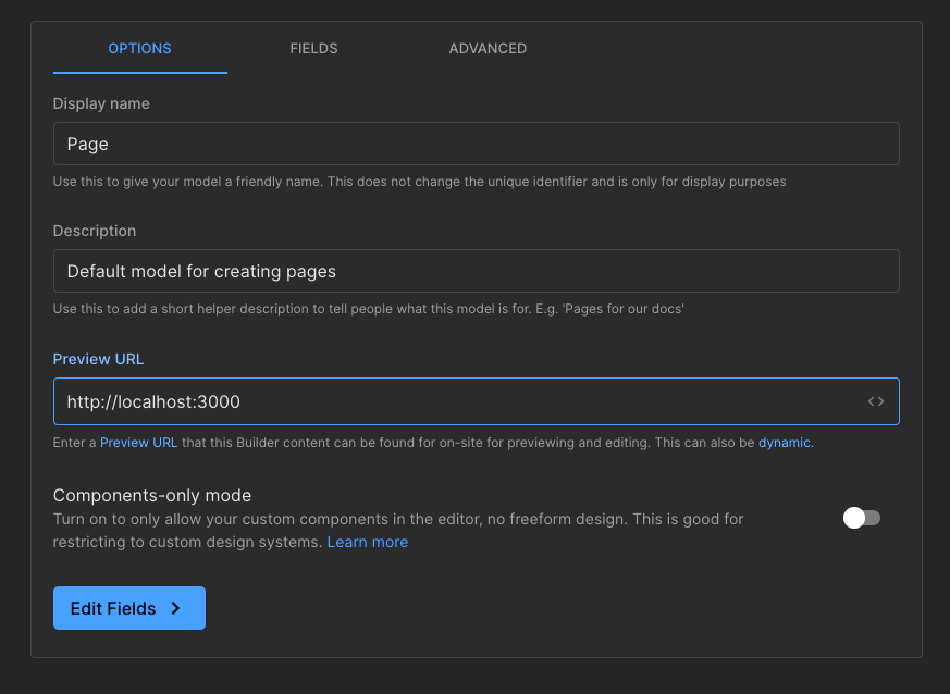
1. Preview URL
The default preview URL is http://localhost:3000/. In builder, see the models and edit the default Page which should look as follows:
 Note: Be sure to hit the Save button to save your changes. You can always change this setting later on, if you want to use a production domain.
2. Setting Up the Environment Variable
Create an .env.local file in the root path and set the ENV variable for the builder key as follows:
NEXT_PUBLIC_BUILDER_API_KEY={your builder key goes here}
3. Running the NextJS App
Run the NextJS app (version 12) and use the preview URL provided in the builder (see "Get the Preview URL Working").
4. API Endpoint
The NextJS app has a basic API endpoint, for example: http://{previewUrl}/api/get-contact-form. You can use this as a template but update the ID for your Kwesform.
5. Fonts and Meta Tags
For fonts and meta tags, refer to the src/_document.js for default settings.
6. Loading Default CSS
To load the default CSS for the Kwesforms Form component, add the following to src/pages/_app.js:
// kwes form styles
import '../third-party/kwes-react-form/dist/assets/loader-878652dd.css';
import '../components/FormLoader/FormLoader.css';
7. Form Styling
Kwesform uses Bulma styling. You can reference Bulma for field or layout customizations within the kwes-form class. For additional styling customizations, use CSS custom properties within the kwes-form class.
8. Customizing Form Styles
In this example, we can customize form styles in the FormLoader.css component:
# src/components/FormLoader/FormLoader.css
.kwes-form {
  border-radius: 10px;
  padding: 10px;

  --kwes-form--label-color: #666;
  --kwes-form--button-bg-color: #1e88e5;
}
You can customize the form styles to suit your needs. Another approach is to override or extend these styles within your own global CSS file or form-specific CSS.
Here's a common set of CSS properties are provided as a reference to help make customizations easier:
--kwes-form-box-shadow: 0 0 8px 0px rgba(0, 0, 0, 0.15);
--kwes-form-padding: 30px;
--kwes-form-bg-color: #fff;
--kwes-form-margin: 0 0 30px;

--kwes-form--success-color: #23d160;
--kwes-form--error-color: #cc0000;
--kwes-form--error-font-size: 0.85em;

--kwes-form--disclaimer-color: rgba(0, 0, 0, 0.5);
--kwes-form--disclaimer-link-color: rgba(0, 0, 0, 0.75);
--kwes-form--disclaimer-margin: 10px auto;
--kwes-form--disclaimer-font-size: 0.85rem;
--kwes-form--disclaimer-line-height: 1.5;

--kwes-form--label-asterisk-color: rgba(0, 0, 0, 0.65);
--kwes-form--label-color: rgba(0, 0, 0, 0.75);
--kwes-form--label-font-size: 1rem;
--kwes-form--label-font-weight: 700;

--kwes-form--help-color: rgba(0, 0, 0, 0.65);
--kwes-form--help-font-size: 0.75rem;
--kwes-form--help-line-height: 2;

--kwes-form--button-bg-color: #368ace;
--kwes-form--button-bg-color-hover: #1471bd;

--kwes-form--title-size: 1.75em;
--kwes-form--title-margin-bottom: 0.5714em;
--kwes-form--title-line-height: 1.2;
--kwes-form--title-color: rgba(0, 0, 0, 0.9);

--kwes-form--sub-title-size: 1.25em;
--kwes-form--sub-title-line-height: 1.5;
--kwes-form--sub-title-margin-bottom: 0.5714em;
--kwes-form--sub-title-color: rgba(0, 0, 0, 0.9);
Next you can review the Form Data and examples within.